Home › Jitsutech University › Tuesday Technology › Data Visualizations with a Pie or Bar Chart?
Tagged: Alternative to Surveymonkey | Jitsutech.com, Build a Survey in Minutes | Jitsutech.com, Canadian Hosted Survey Software | Jitsutech.com
-
AuthorPosts
-
January 6, 2019 at 11:40 am #2182
Jitsutech
KeymasterData Visualizations with a Pie or Bar Chart?
The last step in your Canadian Hosted Survey Research, and sometimes the most fun, is creating data visualizations. Making heads or tails of your respondent data can be a very stimulating process. Today, I will discuss the differences between a Pie Chart and a Bar Chart.
A pie chart is a circular statistical graphic, which is divided into slices or segments to illustrate numerical proportion of the whole. Using a pie chart can provide a quick glance to the respondent(s) feedback, but it cannot represent subtle differences between several segments. For example, if there are 2 to 5 segments, it is easy to understand but if there are more than 6 segments it can be difficult to interpret between the pie slices as it can look cluttered visually.
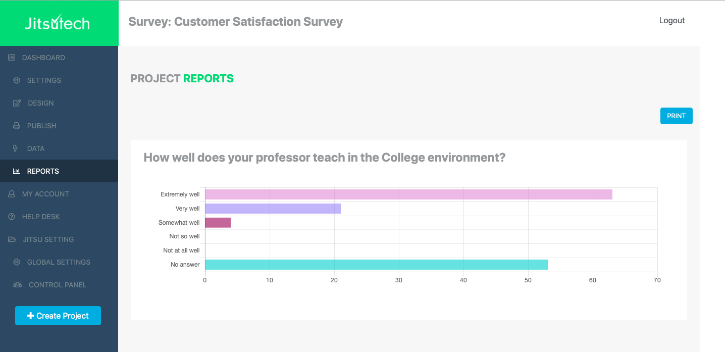
A bar chart is another visual display with rectangular bars which has lengths proportional to the values that they represent. The nice thing is that a bar chart can be displayed in a vertical or horizontal view. Also, using a bar chart can allow the researcher to make comparisons between datasets to show the trends over a period of time. For example, a researcher could compare student feedback over 5 years when they exit a 2 year College program.
In my opinion, both a pie chart and a bar chart are effective in their own way and represent survey results very well. When you decide which one to use, just remember the following tips:
- A pie chart is a circular graph that shows us portions relative to the whole by dividing those portion into slices; And
- A bar chart is a rectanglular graph that shows us the x-axis for categories and y-axis for values, or vise versa.

-
AuthorPosts
- You must be logged in to reply to this topic.
